Motivation
In collaboration with Juthi Dewan, Sam Ding, and Vichearith Meas, we designed this project for our Bayesian Statistics course taught by Dr. Alicia Johnson. We want to thank Alicia for guiding us through Bayes and the capstone experience!
Our project cumulatively included 97 pages of double-spaced text and code! So, for this blog post, we are exclusively reporting our findings and printing only the most essential code chunks. A detailed and reproducible version of this blog post with all code included can be found here.
We were initially interested in characterizing New York City’s internal racial dynamics using demography, geographic mobility, community health, and economic outcomes. As this project developed, we found ourselves thinking about the relationships between transportation (in)access and housing inequity. Our project has two main sections: Subway Accessibility and Transportation and Structural Inequity.
In Subway Accessibility, we explore transportation deserts and the significant determinants of subway access in New York City using two Bayesian classification models. If you have questions or thoughts about this section in particular, please feel free to reach out to Sam or Vichy by email!
While in Transportation and Structural Inequity, we extend our discussion of transportation access to study its relationship to rental prices and evictions using hierarchical Bayesian multivariate regression. In the extended document, we also fit non-hierarchical spatial models to control for the underlying spatial relationships between neighborhoods. However, we omit a comprehensive discussion of these models in this blog post, as Bayesian spatial regression was beyond the scope of this course. If you have questions about these models, please get in touch with either Juthi or me by email!
First, however, let us do a data introduction:
Data Introduction
All data used in this project are from two primary sources: the Tidycensus package and NYC Open Data.
Tidycensus is an R package interface developed by Kyle Walker and Matt Herman that enables easy access to the U.S. Census Bureau’s data APIs and returns Tidyverse-ready data frames from various U.S. Census Bureau datasets. We drew our demographic and socioeconomic data from the 2019 American Community Survey results in the Tidycensus package. A summary of our ACS data variables is below:
borough:NYC Boroughtotal_pop: Total Population Count by Census Tractmean_income: Mean Income by Census Tractbelow_poverty_line_count: Number of People Living Below the 100% Poverty Line by Census Tractmean_rent: Mean Rent by Census Tractunemployment_count: Number of People on Unemployment by Census Tractlatinx_count: Number of Latinx People by Census Tractwhite_count: Number of White People by Census Tractblack_count: Number of Black People by Census Tractnative_count: Number of Native People by Census Tractasian_count: Number of Asian People by Census Tractnaturalized_citizen_count: Number of Naturalized Citizens by Census Tractnoncitizen_count: Number of Foreign-Born People by Census Tractuninsured_count: Number of Uninsured Citizens of any Age by Census Tractgini_neighborhood: Income inequality measured by the Gini Index per Census Tract
Note that these predictors are all measured at the census level. To aggregate these estimates at the neighborhood level, we performed two transformations:
- Compute total sums for every count-based measurement.
- Compute average estimates for remaining non-count, quantitative predictors.
Then, we divide by the total population in each neighborhood to define scaled demographic metrics for count-based demographic predictors. They are as follows:
asian_perc: Percentage of Asian Peoplewhite_perc: Percentage of White Peopleblack_perc: Percentage of Black Peoplelatinx_perc: Percentage of Latinx Peoplenative_perc: Percentage of Native Peoplenoncitizen_perc: Percentage of Foreign-Born Peopleuninsured_perc: Percentage of Uninsured Citizens of any Ageunemployment_perc: Percentage of People on Unemploymentbelow_poverty_line_perc: Percentage of people living below the 100% poverty line.
We used NYC’s Open Data portal and the Baruch College GIS Lab to collect information on the remaining predictors. In particular, we used geotagged locations of Subway Stops, Bus Stops, Grocery Stores, Schools, and Evictions from the Departments of Transportation, Health, Education, and Housing, respectively, to calculate the following variables:
school_count: Public school countseviction_count: Eviction countsstore_count: Grocery store and food vendor countssub_count: Subway station countsbus_count: Bus station countsperc_covered_by_transit: Percent of Neighborhood Within Walking Distance (.5 miles) of Any Subway Stop.transportation_desert_3cat: Subway Accessibility (Poor, Typical, Excellent)
The process involved grouping geotagged locations by the defined neighborhood boundary regions in R’s S.F. package and ArcGIS. We will detail the process of identifying subway deserts in the “Subway Deserts” section.
Data Summaries
Our extended document presents a numeric summary. However, note that we use percent equivalents for most demographic count variables.
We found that Manhattan had the highest population counts, mean rental prices, highest mean income, highest income inequality (e.g., Gini value), the most neighborhoods with Excellent subway access, and the largest proportion of white citizens.
Conversely, the Bronx has the lowest mean income and highest eviction counts, with the highest proportions of people living below the poverty line and the highest number of people with limited subway access. Notably, the Bronx also had the highest densities of Latinx and Black residents of any other borough in New York, meaning that the Black and Latinx residents in New York are experiencing the burden of New York’s structural inequities.
The following sections will explicitly discuss the connections between demographics, transportation access, and housing.
Subway Accessibility
New York City is the most populous city in the U.S., with more than 8.8 million people. To support the daily commutes of its residents, NYC also built the New York City Subway, the oldest, longest, and currently busiest subway system in the U.S., averaging approximately 5.6 million daily rides on weekdays and a combined 5.7 million rides each weekend.
Compared to other U.S. cities where automobiles are the most popular mode of transportation (ahem, Minneapolis), only 32% of NYC’s population commute by car. NYC’s far-reaching transit system is unique, given that more than 70% of the population commutes by car in other metropolitan areas.
Despite having the most extensive transit network in the entire U.S., NYC lacks transit accessibility for some neighborhoods. The consensus among transportation and civil engineering scholars claims that residents who walk more than 0.5 miles to get to reliable transportation lack adequate access to transportation or potentially reside in a transportation desert. We adopted this concept to study these gaps in transportation access for our project. Specifically, we attempt to identify and investigate “Subway Deserts.”
Subway Desert Definition
Extending the USDA’s definition of a food desert, we define Subway Deserts as the percentage of a neighborhood— or any arbitrary geographic area— within walking distance of any subway stop. Citing the U.S. Federal Highway Administration, we defined walking distance as a 0.5-mile radius and computed these regions in ArcGIS. We chose subway stations because of the subway’s reliable frequency, high connectivity between boroughs, and high ridership per vehicle. Our argument against including the number of bus stops in our calculations of transportation access is that the quantity of bus stops does not accurately imply public transport accessibility due to the variability in bus efficiency, punctuality, and use. A significant limitation of our work was the omission of Staten Island because it is not connected to any other borough by subway. Instead, Staten Island users typically drive or train into the city. Further, we felt that the inclusion of Staten Island would mischaracterize the relationship between lacking access and not needing access since Staten Island is an overwhelmingly white, wealthy borough that has high levels of car ownership.
We first geocoded subway stop locations in NYC from the NYC Department of Transportation. Then, using ArcGIS, we created a 0.5-mile-radius buffer for each station and calculated what percent of each neighborhood was covered by a buffer region. We display an example below.
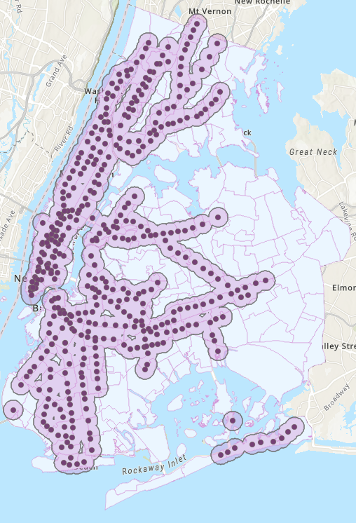
In the graph, buffer zones are in light pink with overlapping boundaries dissolved between stations, while the dark pink dots indicate the exact geographic locations of the stations. Each neighborhood, then, had a percentage score that defined its subway accessibility score.
Upon observation, we categorized the areas served by the subway network into four ordinal categories: Poor, Typical, and Excellent. We defined these categories as 0-25%, 25-75%, and 75-100% of the area within walking distance to some subway stop, respectively. We determined these cutoffs using the distribution of subway coverage percentages plotted below.
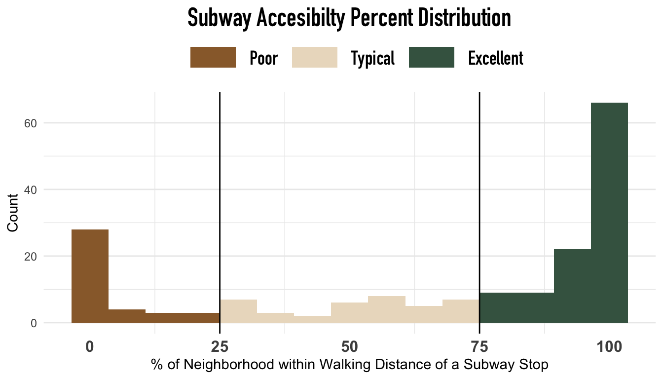
We found that the original data has a bimodal distribution with observations heavily concentrated in 0-25% and 75-100%. This distribution is likely due to Manhattan’s over-saturated transit coverage and the lack of subway access in the suburban neighborhoods of Queens.
| Access Level | Proportion |
|---|---|
| Poor | 0.20879 |
| Typical | 0.20879 |
| Excellent | 0.58241 |
There was an unequal distribution of observations within different access levels where neighborhoods with Poor and Typical access had fewer observations (20.87%; 20.87%) combined than the number of neighborhoods with Excellent access (58.24%).
The following plot details the spatial locations of these transportation categories.

The “Transportation and Inequity” section will discuss this plot further. However, observe that transportation access is best in Manhattan (top-left) and Brooklyn (bottom-left), while the worst is in Queens (right) and the Bronx (center-top).
We describe how we understood and classified transportation deserts using two models in the following two subsections.
Naive Bayes Model
The Naive Bayes classifier is one of the most popular models for classifying a response variable with two or more categories.
We implemented a Naive Bayes classifier on subway access because it is computationally efficient and applicable to Bayesian classification settings where outcomes may have 2+ categories. We predict transportation access categories using mean income, percentage below the poverty line, borough, and the number of grocery stores. Because we are predicting three levels of transportation access, we initially fit this model using the e1071 package to classify subway transit levels. We fit our model below.
set.seed(454)
naive_model <- naiveBayes(transportation_desert_4cat ~
                              mean_income +
                              below_poverty_perc +
                              store_count,
                            data = nyc_naive)
| Access Level | Poor | Typical | Excellent |
|---|---|---|---|
| Poor | 84.21% (32) | 5.26% (2) | 10.53% (4) |
| Typical | 28.95% (11) | 21.05% (8) | 50.00% (19) |
| Excellent | 7.55% (8) | 15.09% (16) | 77.36% (82) |
Under 10-fold cross-validation, our Naive Bayes model had an overall cross-validated accuracy of 67.03%. However, our predictions were most accurate when predicting Poor transportation access (84.21%) and Excellent transportation access (77.36%). The following plot describes the cross-validated accuracy breakdown by each observed transportation access category.

From the plot, it is clear that our Naive Bayes model is sufficient when predicting the extrema of subway accessibility given the overwhelming proportion of true-Poor and true-Excellent classifications. However, our Naive Bayes classifier needs to be improved when considering the inaccuracy for both the limited and satisfactory transportation categories, our data distributions, and interpretability.
Importantly, Naive Bayes assumes that all quantitative predictors are normally distributed within each Y category, and it assumes that predictors are independent within each Y category. Below we verify whether this is an appropriate assumption for our data.
Naive Bayes’s assumption of normality within categories does not hold, unfortunately. These stratified distributions imply that although this is a “good” classifier, it is inappropriate. Further, Naive Bayes is a black box classifier. So, although our classifications are accurate, we cannot make sensible inferential conclusions about the relationship between subway access and our predictors or identify how predictions are made. Our next section describes an alternative Bayesian classification model.
Ordinal Model
An ordinal or ordered logistic regression model predicts the outcome of an ordinal variable, a categorical variable whose classes exist on an arbitrary scale where only the relative ordering between different values is significant. In this case, our subway desert category is an ordinal variable with categories ranging from the least to the most covered (e.g., $[1,2,3]$) by NYC subway stops. Once again, we defined these categories by splitting the percentage covered using two cutpoints, $\zeta_1$ and $\zeta_2$, to create three ordered categories— Poor, Typical, and Satisfactory. Our $\zeta$ are listed below.
$$ \begin{align*} \zeta_1 = 0.25 \\ \zeta_2 = 0.75 \\ \end{align*} $$
Next, we introduce a latent variable, $y^*$, as the linear combination of the $k$ predictor variables. Here, we selected mean neighborhood income ($X_1$), percentage below the poverty line in a neighborhood ($X_2$), the number of grocery stores and food vendors in a neighborhood ($X_3$), and three dummy variables for the borough of our neighborhood ($X_4, X_5, X_6$) as our predictors.
Then we predict the transportation desert status $Y$ for the $i$th neighborhood with the following model:
$$ \begin{align*} Y_i| \zeta_1, \zeta_2,\zeta_3,\beta_1,\dots,\beta_6 &= \begin{cases} 1 & y^{*} < \zeta_1 \\ 2 & \zeta_1 \leq y^{*} < \zeta_2 \\ 3 & \zeta_2 \leq y^{*} \\ \end{cases} \\ \\ y_i^{*} & = \sum_{k=1}^6 \beta_kX_i \\ \end{align*} \\ $$
Where
$$\begin{align*} \zeta_1 = 0.25 \\ \zeta_2 = 0.75 \\ \end{align*}$$
$$ \beta_k \sim N(m_{k}, s_{k}^{2}) \\ $$
It is important to note that there is no intercept in $y_i^*$, which is an omission by the construction of stan_polr’s model and the multi-class outcomes for this ordinal model.
Since we do not have prior information about the relationship between observed transportation access and these specific predictors, we will use the default prior in stan_polr. Specifically, we establish a prior for the location of the proportion of the outcome variance attributable to the predictors. This proportion is commonly known as the $R^2$ metric used in frequentist linear regressions and could be located at any value between (0,1). Using a uniform prior on the location of $R^2$, we say that a perfect explanation of variance and non-explanation of variance in our outcome categories by our predictors is equally plausible. So, we expect that 50% of the variability in transportation access cannot be explained by the mean neighborhood income, the percentage below the poverty line, the number of grocery stores and food vendors in a neighborhood, and the borough. Visit the $R^2$ section in rstanarm ’s documentation here for a more technical overview.
One technical limitation is the paucity of cross-validated error metrics for stan_polr ’s ordinal regression model. To test the model’s fitness on new data, we used a manual train-test split where our training data would include 70% of the original observations, while our test data would consist of the remaining 30%.
ordinal_model <- stan_polr(transportation_desert_4num ~ mean_income + below_poverty_line_perc + store_count,
                    data =data_train, prior_counts = dirichlet(1),
                    prior=R2(0.5), iter=500, seed = 86437, refresh=0, prior_PD=FALSE)
| term | estimate | std.error | conf.low | conf.high |
|---|---|---|---|---|
| mean_income | 0.0000193 | 0.0000138 | 0.0000024 | 0.0000366 |
| below_poverty_perc | 0.0962982 | 0.0425849 | 0.0436633 | 0.1533395 |
| store_count | 0.0220945 | 0.0066117 | 0.0140408 | 0.0313861 |
| boroughManhattan | 2.6072263 | 1.1478840 | 1.2758714 | 4.2042272 |
| Poor | Typical | 2.7512963 | 1.7302249 | 0.5351128 |
| Typical | Excellent | 4.3697139 | 1.8114385 | 2.0579639 |
After removing predictors whose 80% credible intervals included the possibility of non-effect when controlling for other covariates, four significant predictors of an arbitrary neighborhood’s latent $y^*$ function— the ordinal increase between categories— remain. When controlling for relevant covariates, $y^*$ was positively associated with increased mean income, the proportion of people living below the poverty line, and food and grocery store counts. Further, it also seems that there was an increase in $y^*$ when comparing Manhattan to the Bronx, meaning that these predictors were associated with increased transportation access. For more specified interpretations, please see our extended document.
Then, adapting a function written by Connie Zhang into a tidy function, tidy_ordinal_accuracy, we compute the accuracy of the ordinal model below. Specifically, we take the most common category predicted across all of our model’s simulations, then use that modal category as our final prediction.
set.seed(86437)

my_prediction2 <- posterior_predict(
  ordinal_model,
  newdata = data_test)

tidy_ordinal_accuracy(data_test, my_prediction2)
| Access Level | Accuracy |
|---|---|
| Poor | 0.8571 |
| Typical | 0.0909 |
| Excellent | 0.9000 |
| Overall | 0.7272 |
Our ordinal model had an overall cross-validated accuracy of 72.72%. While our model was incredibly accurate when classifying neighborhoods as having Excellent and Poor subway (90%; 85.71%), it was almost uniformly incorrect when classifying neighborhoods with Typical subway access (9.09%). Instead, the ordinal model often categorized neighborhoods with Typical subway access as having Excellent or Poor access to transportation. However, this performance gap was observed in both the ordinal and Naive Bayes classifiers, suggesting a potential issue with our measures of subway accessibility.
In addition to accuracy within each group, we also consider the compositions of the actual vs. predictions. Below we visualize the same error metrics for the ordinal model.
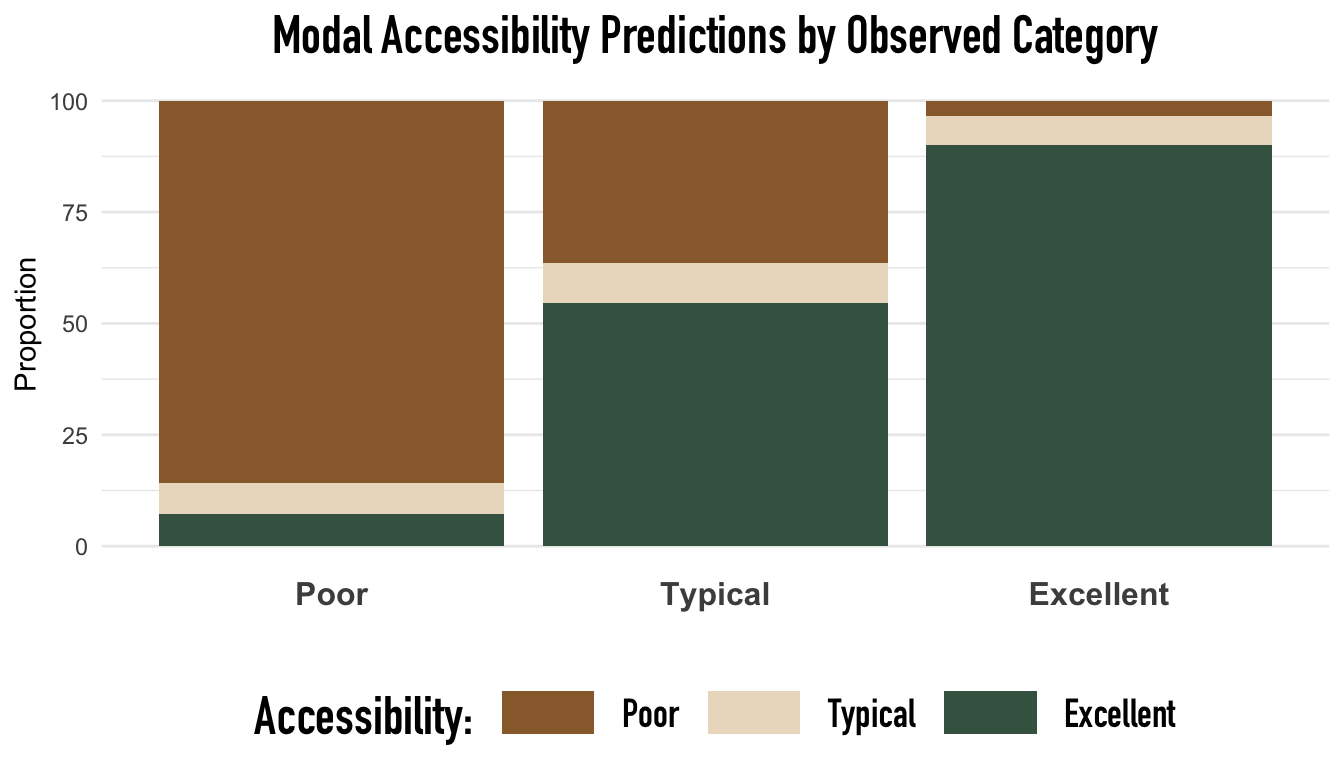
The above graph shows the relative proportion of classified outcomes within each observed outcome category. Again, notice that the ordinal model consistently and predominantly misclassified neighborhoods in the Typical class. Likely, the systematic misclassification of neighborhoods with Typical subway access is a byproduct of our cutpoint criteria when defining the respective levels of transportation inaccessibility and the measurement of walking times— that is, these categories may not be sufficiently distinct or rigorously defined to find reliable differences. Additionally, the severe count imbalance between subway access categories may be another vital contributing factor to the systematic misclassification of the Typical access group, as discriminative trends in larger access categories would be more influential than trends in smaller groups when optimizing the loss function.
In future revisions of this project, we would like to redefine our subway accessibility buffer zones by walking distance and time, manipulate categorical-cutoff thresholds for subway access, and consider resampling methods to better balance model performance with class imbalances. Further, categorizing continuous measures such as subway accessibility can induce a nontrivial loss of statistical information; a potential extension of this project would be to use our continuous measure of subway accessibility and implement Bayesian mixture models to account for the bimodal behavior.
If you are interested in how outcome prediction probabilities vary according to the values of our demographic predictors, we created a shiny app that allows users to manually alter predictor values and identify how classification probabilities may change. Click this link to check it out!
Transportation and Structural Inequity
Transportation access is a pervasive structural issue. However, previous research on transportation access has demonstrated that many of these transportation gaps can also deepen the chasms of racial and class-based inequity. In this analysis, it seemed that low-income and racialized— typically Black and Latinx— communities were most likely to confront transportation inequities. Additionally, we have observed that predominantly Black and Latinx neighborhoods in the Bronx faced some of the highest rates of eviction, likely indicating that these inequities may overlap.
This next section aims to connect transportation (in)access to the racial and class dimensions of common housing inequities. In particular, we wanted to assess transportation access’s relationship with immigrant community size, rental prices, and eviction counts by neighborhood.

Transportation access is typically worst in areas with the highest densities of non-citizen residents, while it is the best in neighborhoods with the highest mean rental prices. Additionally, observe that eviction counts are highly concentrated in north and south NYC— predominantly in the Bronx and Brooklyn— where accessibility to transit can be highly variable.
Unfortunately, rent, transportation access, and eviction counts seem to be associated with the respective density of nonwhite communities.
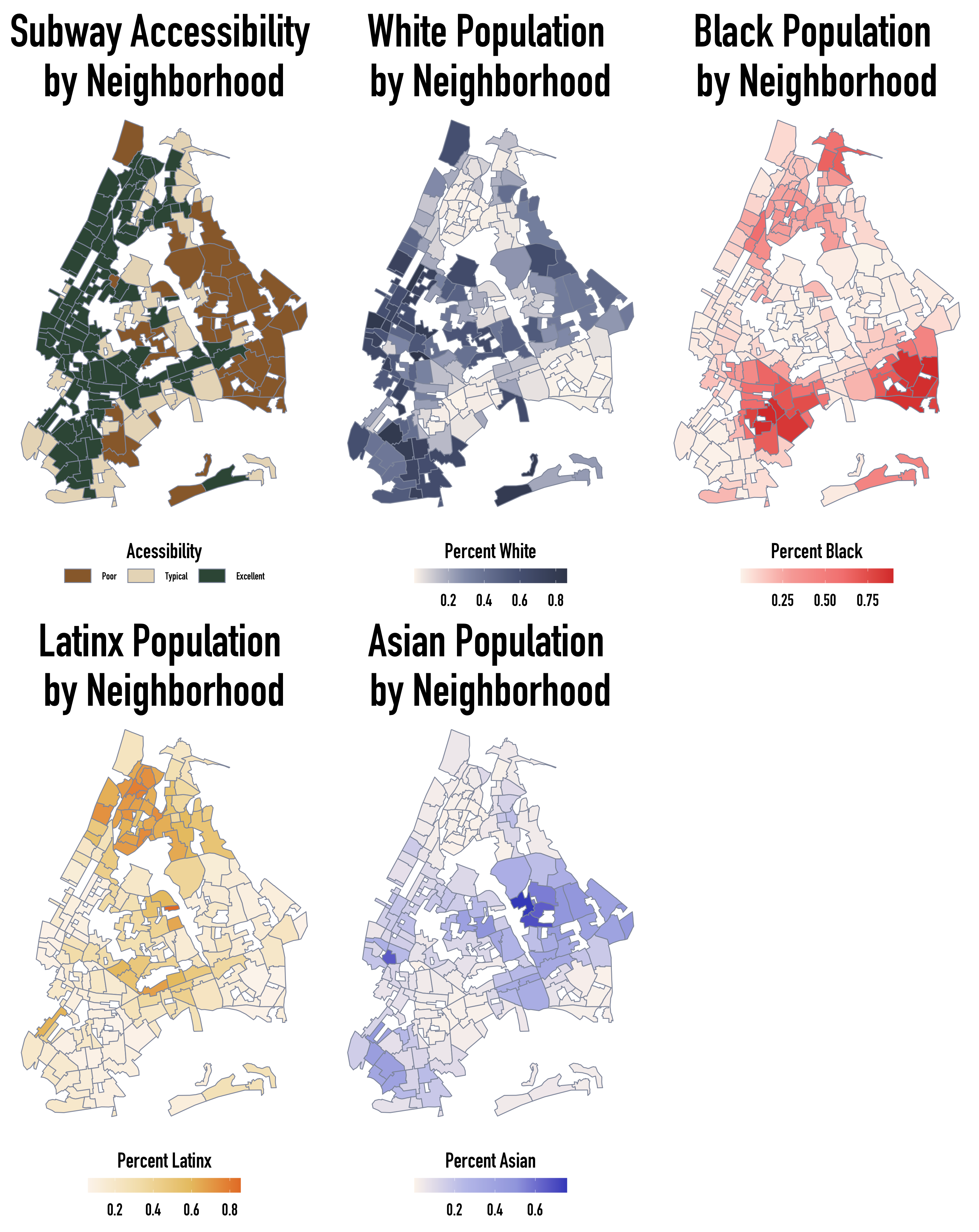
From the plots, neighborhoods with the highest densities of Black and Asian community members also have the poorest scores of subway access. Additionally, eviction counts were generally higher in neighborhoods with the highest proportions of Black and Latinx community members. Unsurprisingly, the converse holds for neighborhoods with the highest proportions of White residents.
Below we visualize how neighborhood eviction counts vary as the proportions of Black, Latinx, Asian, and White residents increase within each transportation access category.

Neighborhood eviction counts are closely associated with the racial demographics of a neighborhood. In particular, the proportion of Black and Latinx residents in a neighborhood is positively associated with increased eviction counts, whereas large White and Asian residential communities are negatively associated with increased eviction counts. However, the direction and magnitude of these relationships vary considerably according to the transit accessibility of a given neighborhood. Variations according to transit accessibility classes were most demonstrable in Latinx and Black communities where observed data became dramatically more diffuse, the range of observed proportions decreased, and nonlinear trends warped as neighborhood accessibility improved from Poor to Excellent.
Lastly, let us consider mean neighborhood rental prices. The following visualizations detail the relationships between the proportion of Black, Latinx, Asian, and White residents with average rental prices in a neighborhood.

Increases in White-resident proportions were uniformly associated with increases in average neighborhood rental prices across all transportation access categories. In contrast, the densities of Black and Latinx residents and average rental prices in a neighborhood were fiercely negatively associated. It then seems that despite living in cheaper homes— and potentially inadequate living conditions due to municipal disinvestment— NYC’s Black and Latinx communities carry the most significant burden of eviction.
Our next section details the statistical models we used to better characterize the precise relationships between housing inequities, urban racism, and transportation access.
Statistical Models
To understand the distributions of immigrant population size, evictions, and mean rental prices in NYC, we fit three simple Bayesian regression models and three hierarchical Bayesian regression models with each variable as an outcome. In the latter set of hierarchical models, we wanted to account for the correlation in demographic characteristics, housing trends, and transportation within boroughs, so we let borough be a grouping variable in our hierarchical models.
In the extended document, we used four evaluation metrics: absolute error metrics, residual distributions, expected-log predictive densities, and the Watanabe–Akaike information criterion (WAIC); to select between our hierarchical and simple models for this analysis. Model evaluation results suggested that hierarchical models of average rental prices and non-citizen counts outperformed their non-hierarchical counterparts, while a simple model was better suited to model eviction counts. As such, this blog post will only describe the construction, implementation, and evaluation of two hierarchical models and one non-hierarchical model. If you’re interested in the complete set of comparisons, please see the extended document!
We list our statistical models and their predictors below:
Non-Citizen Count Hierarchical Model (1)
- Predictors:
transportation_desert_4cat,total_pop,gini_neighborhood,mean_income,mean_rent,unemployment_perc,black_perc,latinx_perc,asian_perc - Grouping:
borough
- Predictors:
Average Rental Price Hierarchical Model (2)
- Predictors:
transportation_desert_4cat,gini_neighborhood,mean_income,black_perc,latinx_perc,asian_perc,bus_count,school_count,store_count,noncitizen_perc - Grouping:
borough
- Predictors:
Eviction Count: Simple Model (3)
- Predictors:
transportation_desert_3cat,borough,total_pop,below_poverty_line_perc,gini_neighborhood,mean_income,mean_rent,black_perc,latinx_perc,asian_perc
- Predictors:
Across all models, we specified weakly-informative normal priors for the $\beta_{k} $’s associated with each predictor $X_{k}$. However, there are differences in terms of model specifications that we outline below:
For 1 and 3, we used weakly informative normal priors on all predictors and the intercept, then allowed stan_glm and stan_glmer to estimate initial priors. This decision was ultimately due to our unfamiliarity with NYC’s history of evictions, the non-citizen population, and their respective relationships to our predictors.
We initially fit parallels of 1 and 3 with a Poisson likelihood rather than a Negative-Binomial likelihood and observed non-constant variance as counts increased and unexpectedly high zero-counts in both the eviction and non-citizen count data. However, we ultimately performed two Negative-Binomial regressions because stan_glm does not support zero-inflated Poisson likelihoods. We removed further discussions of our Poisson regressions from this project.
For 2, we also used weakly informative normal priors on all predictors. However, we specified a normal prior with $\mu = 600$ and $\sigma = 20$ for the scaled intercept of mean rental prices.
Model 1: Immigrant/Non-Citizen Count
$$ \begin{split} \text{Non-Citizen Count}_{ij} \mid \beta_{0}, \beta_1, ..., \beta_k, r & \sim \text{NegBin}(\mu_{ij}, r) \; \; \; \text{where } \log(\mu_{ij}) = \beta_{0j} + \sum^{11}_{k=1} \beta_{k}X_{ijk} \\ \beta_{0j}\mid \beta_{0}, \sigma_0 & \stackrel{ind}{\sim} N(\beta_0, \sigma_0^2)\\ \beta_{0c} &\sim N(0, 2.5^2) \\ r &\sim \text{Exp}(1)\\ \sigma_0 &\sim \text{Exp}(1)\\ \beta_{k} &\sim N(0,s_k^2) \end{split} $$
where
$$ \begin{align} s_k \in \{ &5.5004, 7.9328, 4.9972, .0004, 56.9002,\\ & 0.0074, 0.5699, 39.9937, 0.993, 1.142, 1.6003\} \end{align} $$
We fit our model using stan_glmer below.
hi_noncit_model <- stan_glmer(
  noncitizen_count ~
    transportation_desert_4cat +
    total_pop + gini_neighborhood +
    mean_income + mean_rent +
    unemployment_perc +
    black_perc + latinx_perc + asian_perc + (1|borough),
  data = modeling_data,
  family = neg_binomial_2,
  chains = 4, iter = 1000*2, seed = 84735, refresh = 0
)
Next, we check its distributional fit to our data.

Our simulations (light green) of non-citizen count distributions were generally consistent across iterations. However, simulations were strongly biased from the observed non-citizen counts and likelihood structure, resulting in the more frequent prediction of very-small non-citizen counts. Additionally, the variance between simulations increased as non-citizen counts increased. While alternative zero-inflated prior structures may better simulate our data, we felt that the negative binomial model was a sufficient fit for the observed distribution, given the concordance between our simulations and observed data.
Model 2: Mean Neighborhood Rental Prices
$$ \begin{split} \text{Mean Rental Price}_{ij} \mid \beta_{0j}, \beta_1, \dots, \beta_k,\sigma_y & \sim N(\mu_{ij}, \sigma_y^2) \; \; \; \text{where } \mu_{ij} = \beta_{0j} + \sum^{11}_{k=1} \beta_{k}X_{ijk} \\ \beta_{0j} & \stackrel{ind}{\sim} N(\beta_0, \sigma_0^2)\\ \beta_{0c} &\sim N(1600, 20^2) \\ \sigma_y &\sim \text{Exp}(1)\\ \sigma_0 &\sim \text{Exp}(1)\\ \beta_{k} &\sim N(0,s_k^2) \end{split} $$
where
$$ \begin{align} s_k \in \{ &24.1301 34.8009 21.9225 249.6185 0.0325 4.3562 \\ & 5.0098 7.0204 110.1265 1.7160 0.2803 \} \end{align} $$
Once again, note that we are specifying the parameters of our scaled intercept prior, $\beta_{0c}$ so that the Typical mean neighborhood rental price follows a N(1600,20^2)$ distribution. In contrast, our priors for the $\beta_k$ are weakly-informed negative priors. We chose our prior intercept specifications of the mean rental price ($\beta_{0c}$) using Juthi’s experience renting in NYC and a group conversation about Typical rental prices we would elect to pay in NYC, Los Angeles, and other major cities. However, we decided to continue using weakly-informative normal priors for the predictors because we were unsure about their relationship— if any— to rental prices.
We fit our model using stan_glmer below.
hi_rent_model <- stan_glmer(
  mean_rent  ~
    transportation_desert_4cat + gini_neighborhood +
    mean_income + black_perc + latinx_perc + asian_perc+
    below_poverty_line_perc + school_count + store_count + (1 | borough),
  data = modeling_data,
  family = gaussian,
  prior_intercept = normal(1600, 20, autoscale = TRUE),
  prior = normal(0, 2.5, autoscale = TRUE),
  chains = 4, iter = 1000*2, seed = 84735, refresh = 0
)
Next, we check its distributional fit to our data.

Our simulations were relatively consistent. However, these simulated distributions are much more variable than those we saw in our non-citizen rent model. Importantly, our simulated normal posterior distributions also had higher variance than the observed data, likely because average rental prices were not perfectly normally distributed. As always, we could manipulate our likelihood to better accommodate the fat right tail and asymmetric skew of our data, but our model seems sufficient.
Model 3: Eviction Count
$$ \begin{split} \text{Eviction Count}_{i} \mid \beta_{0c}, \beta_1, ..., \beta_k, r & \sim \text{NegBin}(\mu_i, r) \; \; \; \text{where } \log(\mu_i) = \beta_{0c} + \sum^{14}_{k=1} \beta_{k}X_{ik} \\ \beta_{0c} &\sim N(0,2.5^2)\\ r &\sim \text{Exp}(1)\\ \beta_{k} &\sim N(0,s_k^2) \end{split} $$
where
$$ \begin{align} s_k \in \{ &5.5004, 7.9328, 4.9972, 5.4697, 6.443, 5.3347, .0001, \\ &25.1032, 56.9002, 0.0074, 0.5699, 0.993, 1.142, 1.6003 \} \end{align} $$
We fit our model in stan_glm below.
eviction_model <- stan_glm(
  eviction_count  ~
    transportation_desert_3cat + borough + total_pop +
    below_poverty_line_perc + gini_neighborhood + mean_income + mean_rent+
    black_perc + latinx_perc + asian_perc,
  data = modeling_data,
  family = neg_binomial_2,
  chains = 4, iter = 1000*2, seed = 84735, refresh = 0
)
Next, we check its distributional fit to our data.
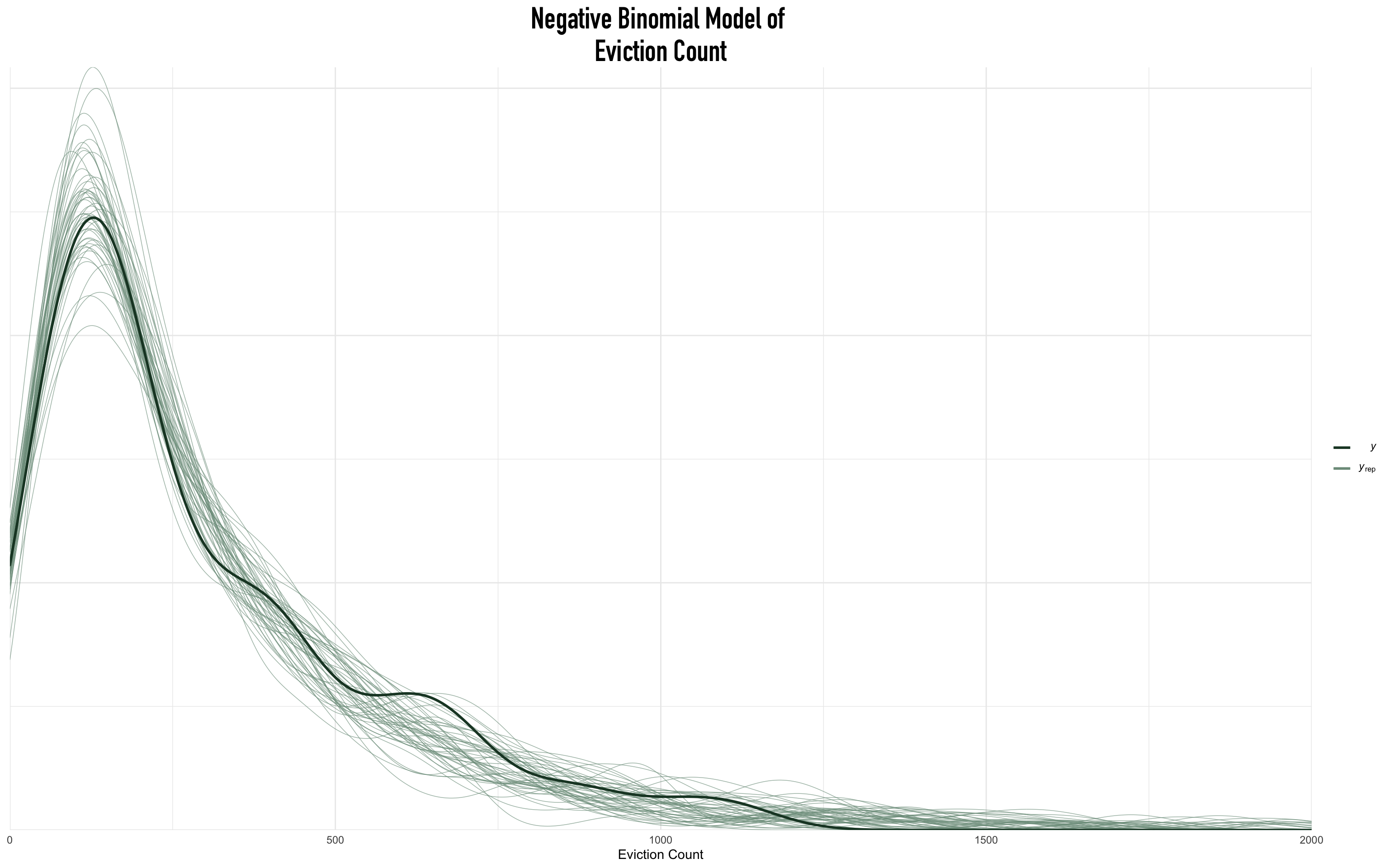
The simulation behavior of our proposed eviction model was excellent. Simulations were dramatically consistent across iterations and consistent with the observed data on eviction counts. While we could re-parameterize our model to accommodate the local maxima that occurred as eviction counts increased or generate more consistent posterior simulations, the proposed non-hierarchical model was fantastic.
In the following sections, we review each model’s outcome and what they tell us about the relationships between transportation and housing.
Results & Discussion
Results
In this section, we detail our findings from our statistical models. In this section, we emphasize the broader conclusions of our models and only report the nature of the associations between our outcomes and predictors (e.g., positive or negative). For individualized interpretations of each predictor for each model, please see the “Full Interpretations” section in the appendix!
Model 1: Immigrant/Non-Citizen Count
After removing predictors whose 80% credible intervals included the possibility of non-effect when controlling for other covariates, there were seven significant predictors of an arbitrary neighborhood’s non-citizen counts. When considering the random effects of the neighborhood borough and controlling for relevant covariates, non-citizen counts were positively associated with better subway access (Typical and Excellent), total population counts, mean rental prices, and the percentages of Black, Latinx, & Asian people. At the same time, mean neighborhood income was negatively associated with non-citizen counts. The following table lists the specific $\beta$ values (labeled as “estimate”) for each predictor, ordered by their association.
| term | estimate | std.error | conf.low | conf.high |
|---|---|---|---|---|
| (Intercept) | 685.0441613 | 0.4623658 | 375.2980843 | 1244.8125336 |
| transportation_desert_3catExcellent | 30.0759855 | 0.0882443 | 15.9210992 | 46.3315367 |
| transportation_desert_3catTypical | 27.3620668 | 0.0872566 | 14.3736638 | 42.6556182 |
| asian_perc | 18.8222735 | 0.0241361 | 15.2059006 | 22.5213017 |
| latinx_perc | 12.5387035 | 0.0206061 | 9.6160788 | 15.5833685 |
| mean_rent | 6.2746982 | 0.0170524 | 4.0170467 | 8.6874535 |
| black_perc | 4.8884977 | 0.0152009 | 2.8488783 | 6.9805750 |
| mean_income | -0.0774559 | 0.0002360 | -0.1081928 | -0.0481245 |
| total_pop | 0.0025529 | 0.0000015 | 0.0023555 | 0.0027571 |
Ultimately, this model demonstrates that immigrant hot spots in New York City tend to form in economically disadvantaged neighborhoods with better subway access and larger nonwhite populations.
Model 2: Mean Neighborhood Rental Prices
We observed that when considering the random effects of the neighborhood borough and controlling for relevant covariates, mean rental prices were associated with five predictors. Specifically, we observed meaningful increases in mean rental prices when comparing neighborhoods with Excellent subway access to neighborhoods with Poor subway access. We also saw that neighborhood rental prices were positively associated with mean neighborhood income and the proportion of Asian residents in a neighborhood. Additionally, we found that mean rental prices were negatively associated with the proportion of a neighborhood’s Black community and the number of schools. The following table details the specific $\beta$ values (labeled as “estimate”) for each predictor, ordered by their association.
| term | estimate | std.error | conf.low | conf.high |
|---|---|---|---|---|
| (Intercept) | 7.9479617 | 1.9588988 | 5.4139670 | 10.3884810 |
| transportation_desert_3catExcellent | 0.7386732 | 0.4279717 | 0.1953634 | 1.2573126 |
| asian_perc | 0.2472390 | 0.1044256 | 0.1126897 | 0.3791817 |
| mean_income | 0.0122325 | 0.0007640 | 0.0112784 | 0.0132181 |
| school_count | -0.0346378 | 0.0261830 | -0.0679695 | -0.0008310 |
| black_perc | -0.0932831 | 0.0699029 | -0.1804310 | -0.0043524 |
Our results indicate that economically privileged neighborhoods with the best subway access tend to have the highest mean rental prices and lower proportions of Black residents. This conclusion is intuitively true, given that housing prices are typically determined in response to the economic composition of renters. There is a cyclical relationship between rental prices and economic wealth where wealthy renters will select neighborhoods, and rental prices in affluent neighborhoods will increase. Moreover, given NYC’s longstanding history of redlining and the dramatic inequities between Black and White people in the United States, it is, of course, true that these high rental prices areas will have lower proportions of Black residents.
We were surprised that the proportion of Asian residents in a neighborhood was positively associated with mean rental prices. This relationship indicates that Asian residents in NYC may opt to live in neighborhoods with higher rental prices or that Asian residents may be relegated to areas with very high rental prices. Both possibilities can be true given the vast diversity of Asian residents' economic privilege and the dramatic differences between Asian ethnic communities in NYC. For example, Chinese-Americans in NYC are the second largest ethnic group and have established multiple rooting neighborhoods— “Chinatowns”— throughout NYC since the 1880s; the first of the nine was the Manhattan Chinatown. After a century, these neighborhoods have established internal business networks and accumulated sufficient economic wealth that the experience of Chinese-American neighborhoods in NYC may not be comparable to newly-formed Asian ethnic enclaves. In contrast, prior work has shown that Asian-American poverty rates in NYC are some of the highest in the country. It is then likely that the omission of specific Asian-ethnic data and the aggregated nature of our economic data has biased our posterior of the relationship between rental prices and Asian resident density.
Lastly, we found that mean rental prices were negatively associated with the number of schools in NYC, which is likely a byproduct of how excessively urban, well-connected areas in NYC do not typically have families with children living in them.
Model 3: Eviction Count
We determined that many racial inequities associated with rental prices were replicated in the number of eviction counts by neighborhood.
Specifically, we found that even when controlling for our covariates, neighborhood eviction counts were positively associated with income inequality, better subway access (Typical and Excellent), the percentages of Black & Latinx residents, mean rental prices, and total neighborhood population count. In contrast, our models suggest that eviction counts were negatively associated with mean income and the percentage of Asian residents.
| term | estimate | std.error | conf.low | conf.high |
|---|---|---|---|---|
| (Intercept) | 22.8139773 | 0.6798254 | 9.5267594 | 54.2678342 |
| gini_neighborhood | 80.3379372 | 0.2774821 | 26.4161912 | 159.2654468 |
| transportation_desert_3catTypical | 40.0730585 | 0.1001190 | 22.7591920 | 60.1444803 |
| transportation_desert_3catExcellent | 38.4077067 | 0.1037129 | 21.0164324 | 57.8949116 |
| black_perc | 17.0793046 | 0.0180324 | 14.4424911 | 19.8864906 |
| latinx_perc | 7.0259485 | 0.0293631 | 3.0643410 | 11.2254638 |
| mean_rent | 4.2501958 | 0.0194063 | 1.7510847 | 6.8718171 |
| total_pop | 0.0022296 | 0.0000017 | 0.0020005 | 0.0024700 |
| mean_income | -0.1289959 | 0.0003143 | -0.1701592 | -0.0881682 |
| asian_perc | -5.6959800 | 0.0293369 | -9.2950278 | -1.8953634 |
We have confirmed that even after adjusting for the putative factors of economic instability and evictions (e.g., income, rental prices, and population size), neighborhoods with a substantial proportion of Black and Latinx residents in NYC are experiencing higher counts of eviction, despite tending to live in cheaper neighborhoods. Specifically, 10% increases in the percentage of Black and Latinx residents are associated with approximately 17% and 7% increases from the Typical eviction count across NYC, respectively. Once again, given the enforced precarity and exploitation of Black and Latinx communities in the United States, it is no surprise that eviction counts are associated with a neighborhood’s racial composition.
We were also surprised that the proportion of Asian residents in a neighborhood was negatively associated with eviction counts. This trend may be another byproduct of the economic stability and developed housing markets in specific Asian ethnic communities. Our results also affirm that within-neighborhood income inequalities can be critical factors in defining eviction counts, suggesting that racist housing policies alone do not sufficiently explain the housing inequities observed in NYC.
Interestingly, when accounting for the above economic and demographic predictors, we were surprised to see that eviction counts were lower in neighborhoods with Poor subway access when compared to neighborhoods with Typical and Excellent access. The negative association between Poor subway access and eviction counts may result from the gentrification of desirable areas or austere renting policies set by landlords in neighborhoods with particularly competitive housing markets. However, one analysis, which aimed to explore the transit-induced displacement hypothesis using eviction rates, suggested that there did not exist a statistically significant relationship between eviction rates and newly-constructed transit neighborhoods. However, our results suggest that there is a connection between increased subway access and eviction counts. It is plausible that this difference may be attributable to the historical preconditions of redlining in NYC; the fact that many of NYC’s neighborhoods have historically been connected to the subway system, so they are not “newly transit-accessible” like those studied in Delmelle et al.’s analysis; or that our current model specifications may be inappropriate for our data.
Discussion
Regardless of our models and their respective performance outcomes, we make the strong statement that the broader power structures and the housing and racial/ethnic inequities they induced must be rigorously addressed in a joint effort between citizens, revolutionary groups, and policymakers. Health begins at home. Moreover, as our report has shown, if NYC’s Black and Latinx residents are being crushed under the fist of inequity and consequently experiencing increased risks of eviction or tenuous rental prices— it becomes a health imperative to critically and revolutionarily address NYC’s housing system and the support systems available for immigrant communities.
Although much work went into designing models with causal blocking and confounding in mind, our models still need to be improved. Some significant limitations involved the encoding of transportation deserts and the presence of unmeasured confounders. Importantly, we acknowledge that identifying, measuring, and controlling against the fiercely-interconnected web of structural racism and housing inequity is likely intractable. To that end, we urge readers to approach our results with skepticism, as we could not account for potentially necessary predictors, such as a neighborhood’s rent control policies, nor have we adjusted for the specific reasons behind each observed eviction.
Importantly, we found statistically significant spatial clustering of non-citizen counts, eviction counts, and mean rental prices using Moran’s I from the spdep package, which indicates that the spatial relationships between neighborhoods may have also biased our results.
| Term | statistic | p.value | parameter | method | alternative |
|---|---|---|---|---|---|
| Non-Citizen | 0.2343861 | 0.001 | 1000 | Monte-Carlo simulation of Moran I | greater |
| Mean Rent | 0.6509345 | 0.001 | 1000 | Monte-Carlo simulation of Moran I | greater |
| Eviction | 0.5667908 | 0.001 | 1000 | Monte-Carlo simulation of Moran I | greater |
As such, we could extend this work to the spatial domain using methods from the CARBayes or INLA packages. Following work by Katie Jolly and Raven McKnight, we have outlined a spatial workflow for both the eviction and rental price models using CARBayes in the appendix of the extended document. However, because spatial models were beyond the scope of this project and class, we’d like to emphasize that in a more detailed analysis, the models we outline in the appendix would likely be adjusted to use different data distributions, spatial effect priors (e.g., BYM, Intrinsic CAR, etcetera), and other priors of our model coefficients. Further, in a more detailed analysis, we would explicitly describe the mathematical construction of the models.
Sofia Barragan
Biostatistics PhD Student
My research interests include minority health, pediatric cancer, and bayesian biostatistics